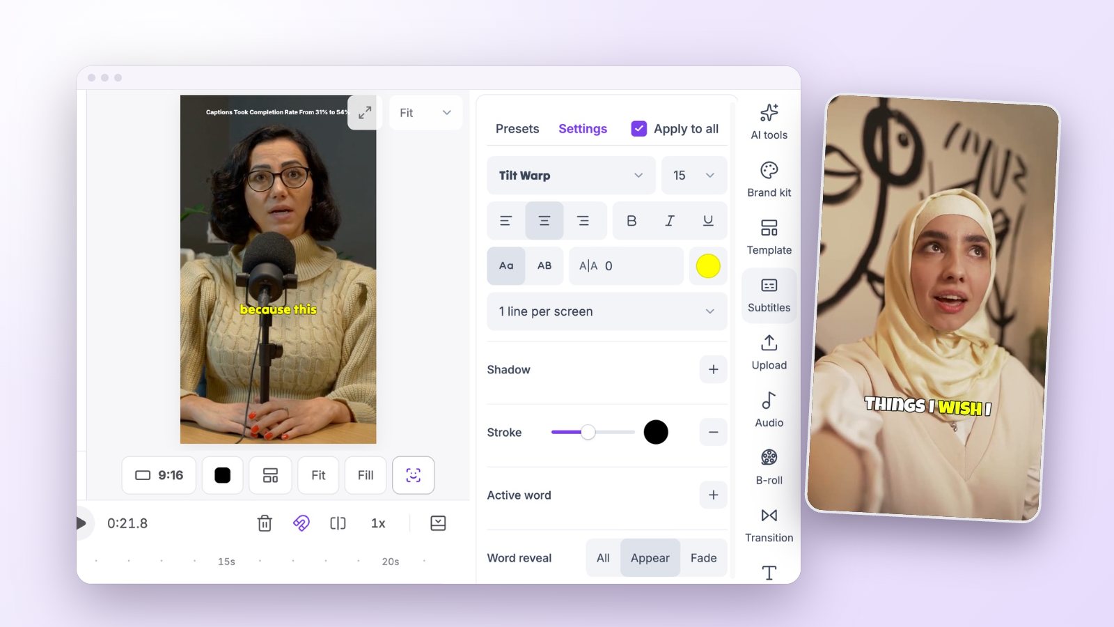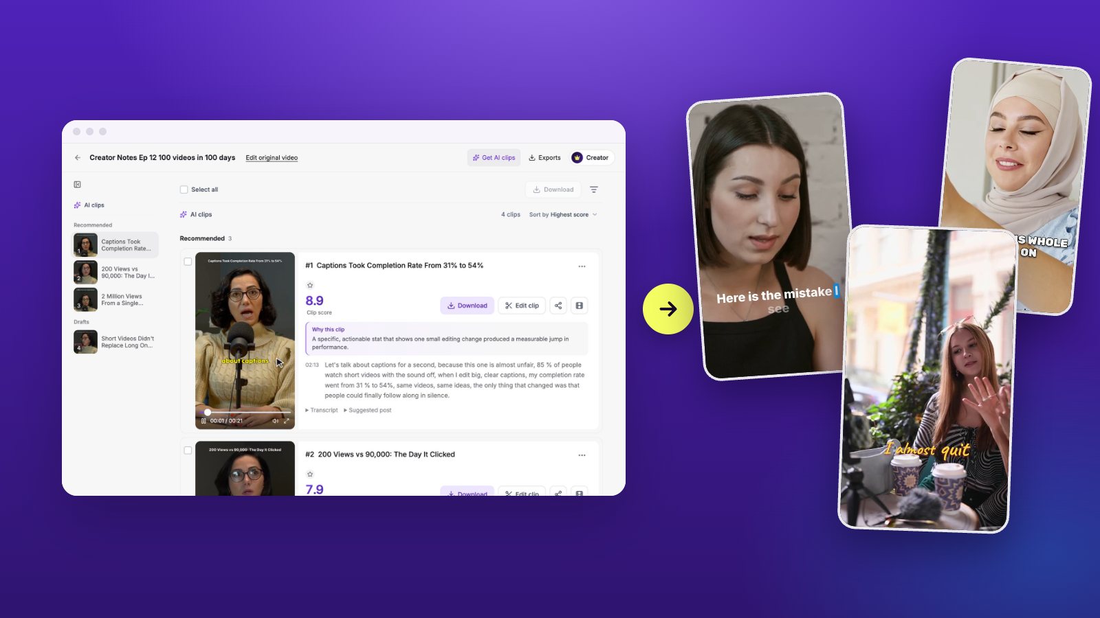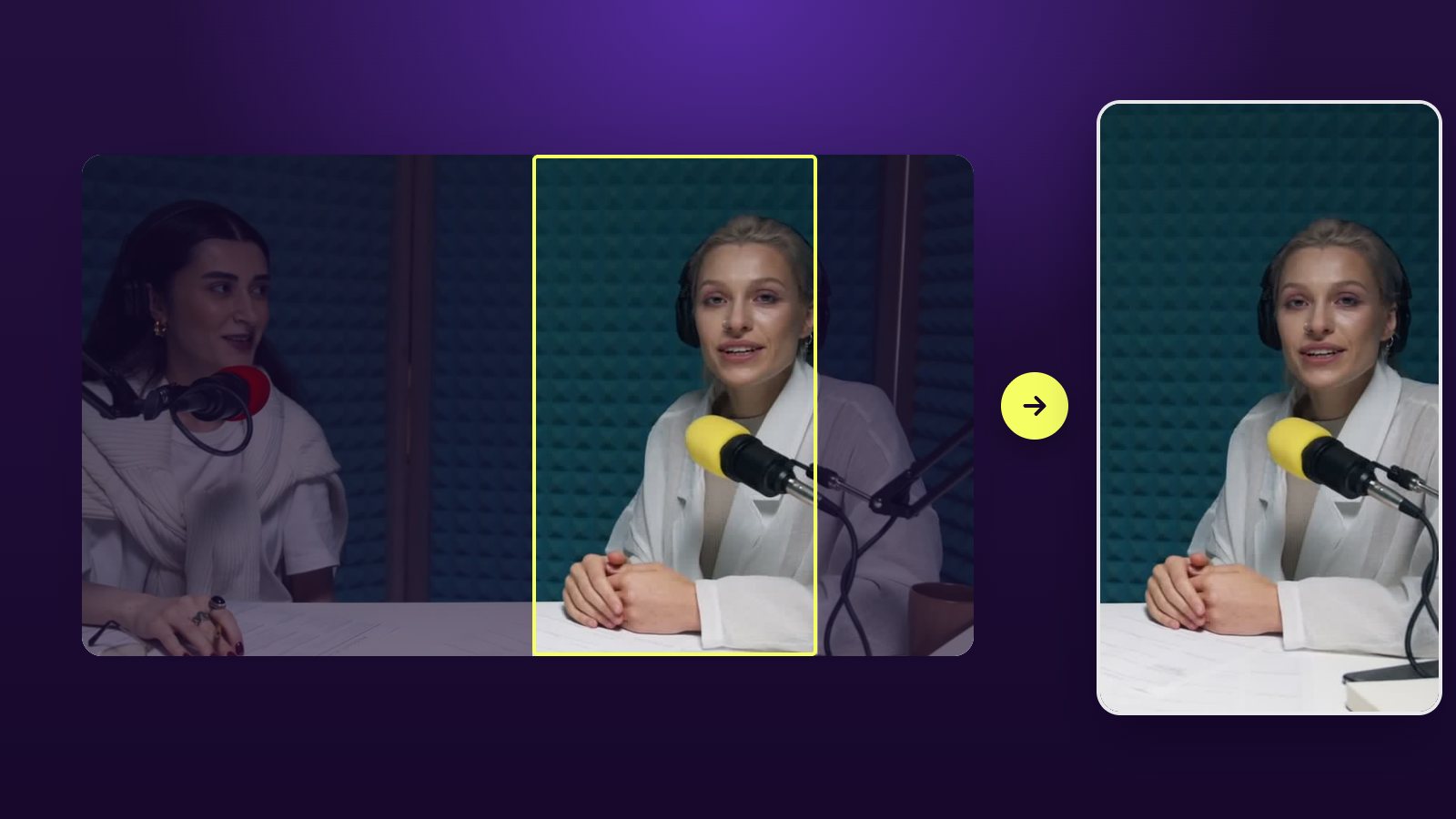
Captions do two jobs. They let people follow with the sound off, and they give the eye something that moves. A caption style that does both well can lift how long people stay. One that gets in the way does the opposite.
Why captions do more than subtitles
Feeds start videos muted, and many people never turn the sound on: they are on a train, in a queue, or next to someone asleep. For those viewers the captions are the video. Even with sound on, moving text holds the eye in the first seconds, when the choice to stay or scroll is made.
That is why caption style is worth ten minutes of thought. You will reuse the choice in every clip you post.
Size and position come first
Captions should be readable on a phone held at arm’s length. Two lines at most, in the lower third but above the platform’s own buttons and description. If the speaker’s face is low in the frame, move the captions down or the frame up; never cover the mouth.
Pick a font for a small screen
Heavy sans-serif type survives compression and small screens. Thin or decorative faces can look elegant on a monitor and vanish on a phone in daylight. If you want a lighter look, make the text larger and add a soft shadow.
Give the text an edge. White letters disappear on a white shirt, so use an outline, a shadow or a box behind the words. An outline keeps the picture visible; a box is the most readable on busy backgrounds.
Highlight the spoken word
Word-by-word highlighting keeps the viewer in sync with the voice. It can be a color change, a box behind the word, or a slight pop in size. Pick one. Stacking three effects makes text harder to read, not easier.
Vidoveli has nine animated styles built on this idea, from bold caps with a colored active word to a quiet card that darkens as words are spoken.
How many words on screen at once
One to three words at a time feels fast and suits short, punchy lines. It also forces the viewer to keep up, which is tiring over a full minute. Two short lines at a time is calmer and better for explanations.
A simple test: play the clip muted at normal speed. If you cannot read every caption comfortably, show fewer words or keep them on screen longer.
Match the style to the content
A style sets a tone before anyone reads a word.
- Bold caps with an outline suit energetic talk, sport, and reaction clips.
- One or two words at a time suit punchy advice with a strong rhythm.
- A clean card or thin type suits interviews, B2B and education.
- Handwriting or serif accents suit lifestyle and personal stories.
Emphasize keywords, sparingly
Coloring the two or three words that carry the meaning helps a skimming viewer. Coloring every third word helps nobody. The same goes for emoji: one that adds a beat of humor or clarity is welcome, a row of them is noise. Vidoveli’s AI can suggest both; treat the suggestions as a draft.
Check names, numbers and line breaks
Automatic captions are accurate on everyday speech and weaker on names, brands and figures. Read every caption once before you export. Fix a line break that splits a phrase in an odd place; “New / York” reads worse than “in New York / last week”.
A five-point check before you export
Run through this list once per clip. It takes under a minute.
- Can you read every line on a phone at arm’s length?
- Are the captions clear of the face and of the platform’s buttons?
- Are names, brands and numbers spelled correctly?
- Is the highlighted word in step with the voice?
- Does the style match the tone of what is being said?
Think about translation
If part of your audience speaks another language, translated captions are the cheapest way to reach them. Keep the original on screen with the translation below it for bilingual audiences, or export one version per language.